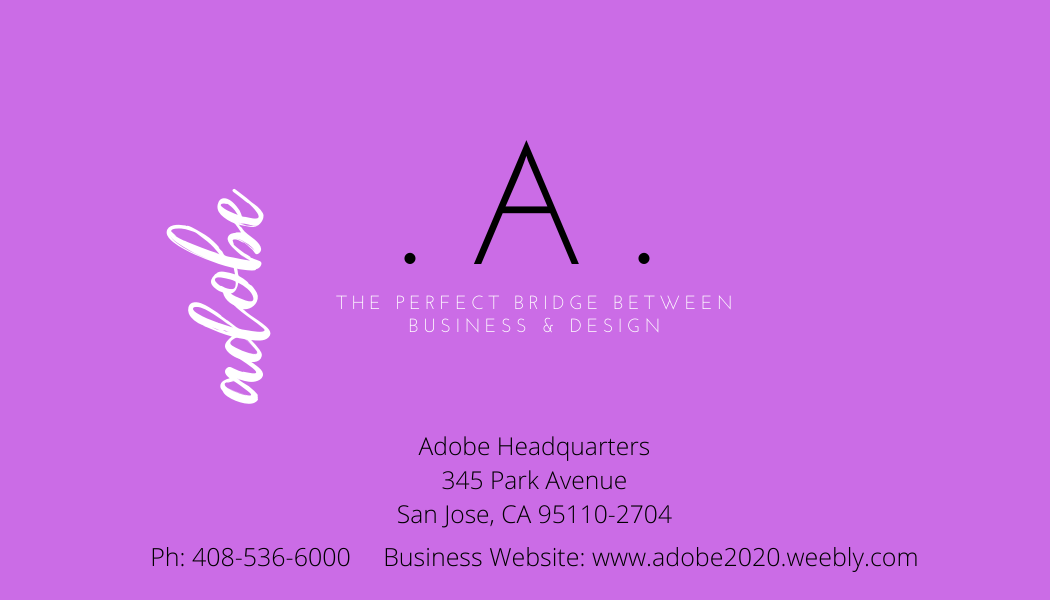
I created the new and improved business card for Adobe after creating the new logo. I wanted to use the same design format and text as used in the logo and tagline. Again, I used both sans serif and serif fonts. I incorporated the purple color as it conveys many things, but creativity was the most important vibe I wanted to convey. I chose to turn the fun “Adobe” title sideways as it is aesthetically pleasing to the eye. I made sure to include Adobe’s US Headquarters’ address as well as the headquarters’ phone number. I included the business website that I have created. Overall, if this business card was lying in a stack of others, I would hope that the color would help it stand out along with the white text. With the revamp of this brand, I am hoping that in the future, Adobe will be so well recognized that it will be soon known as “.A.”.
