|
Adobe 2.0 strives to reach the next level.
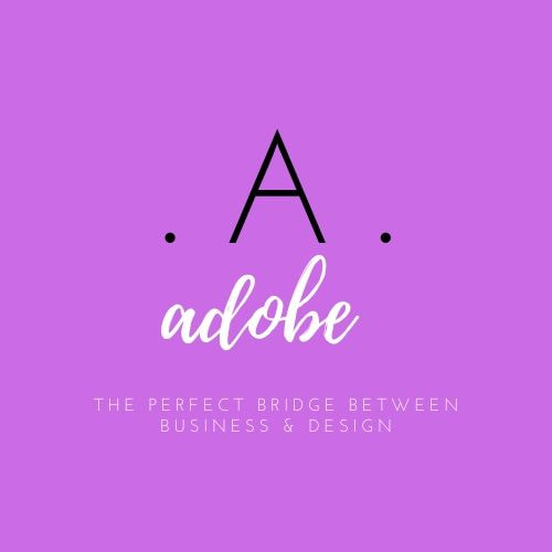
Adobe's logo has been revamped transforming it nearly completely. A purple background was chosen as the color purple conveys a creative, distinguished, luxurious vibe. It also conveys extravagance which can be conveyed through design and unconventional feeling. Both Serif and Sans Serif fonts were used to bring a light, playful feel as Adobe has branched off and created more creative programs than the original business oriented platforms. Design meaning: a capital “A” with periods on both sides was designed to signify that Adobe is one in a million. Adobe is so well known it can be recognized by a single letter as we have transformed the business and design fields. The word “Adobe” was designed in a fun playful script to entice it’s users to use their creativity and think outside the box. The tagline “The Perfect Bridge Between Business and Design” was used because that is what Adobe is known for. Page builders such as PDFs is one of Adobe's most well know programs in the business field. However, from a design stand point, editing programs such as Photoshop and Lightroom, design programs such as Illustrator, InDesign, Animate and InCopy are most used around the world. Adobe has received a fresh, new, fun feel to empower business people and designers to use the product for any of their needs. |
